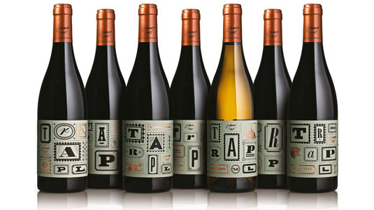
Typejockeys co-founder Michael Hochleitner walks through a recent identity project for Trapl Wines.

Austrian studio Typejockeys was asked by Trapl Wines to develop an identity for its new range of seven luxury wines.
Although wine-maker Johannes Trapl has had success around the world and is relatively famous in Austria, this time he didn’t want his name displayed too prominently. Instead he wanted a completely different design approach.
Faced with a fairly open brief, Typejockeys started by researching the vineyard and its processes thoroughly, before creating 18 initial concepts. Here, co-founder Michael Hochleitner walks through the key stages of Typejockeys’
01. Meeting the client
 The first step of our process is always to get an insight into the product we are supposed to help sell. We learnt about Johannes Trapl’s principles, and he showed us how and why he makes wine of this quality. We were inspired by the things we saw and the stories we heard.
02. First sketches
 Our initial sketches involved looking at embroidery and other crafts. The idea was connected to the handmade nature of the wines so we thought about adding a handmade look to the whole
label. It didn’t really work in test prints but it sowed the seed for the next steps.
Our initial sketches involved looking at embroidery and other crafts. The idea was connected to the handmade nature of the wines so we thought about adding a handmade look to the whole
label. It didn’t really work in test prints but it sowed the seed for the next steps.
03. Initial layouts
 Taking the structure of picture walls as a starting point, we developed a label that told stories about the wine and the winemaker. We created a number of different illustrations and roughly put them in a grid. The client liked the personal touch and we started to work on refining this idea.
04. Refining the idea
 We brainstormed with Johannes Trapl and his wife about what little details could end up in the final labels. At the end we had a list of some obvious but also some rather unusual ideas, including abstracted images of the vineyard, pictures of earthworms and his machinery.
05. Lettering and type
 Type design gets a lot of attention in all our work. Most of the lettering we used for the bottle was inspired or adapted from historic typefaces, with
a few modern touches. All the letters were drawn
to fit the size of the frames, as we knew composition was going to be a challenge.
Type design gets a lot of attention in all our work. Most of the lettering we used for the bottle was inspired or adapted from historic typefaces, with
a few modern touches. All the letters were drawn
to fit the size of the frames, as we knew composition was going to be a challenge.
06. Legalities
 In Austria, the government has very strict laws about how big the obligatory information must be printed. The alcohol level must have a cap height of at least 5mm for example. This stage was a case of meticulously going through the designs and making sure everything was legal.
07. Final adjustments
 The layout was very detailed with thin lines that we had to perfect. Separations had to be made for two offset printing plates, foil embossing, blind embossing, and flexo printing. It was of course a delicate job for the printer to adjust the different techniques to align everything perfectly.
08. Choosing capsules
.jpg) The copper colour of the capsules (the foil at the top of the bottle) was chosen very carefully to match the foil printing on the labels. We opted for a simple capsule layout in the end, to balance with the busyness of the label design. They were printed in black with a flexo technique.
The copper colour of the capsules (the foil at the top of the bottle) was chosen very carefully to match the foil printing on the labels. We opted for a simple capsule layout in the end, to balance with the busyness of the label design. They were printed in black with a flexo technique.
09. Additional applications
 We designed a matching wine box, using some illustrations from the labels but also developing new elements with bigger proportions. The wine box was printed with a metallic offset colour as we wanted the box to fit in with the bottles, but also look visually compelling from a distance.]]>