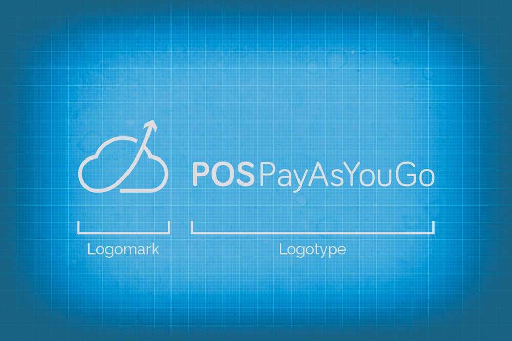
In the field of logo design, you will find that most logos consist of lettering, often called a logotype, and a symbol or icon called a logomark. But what do these terms mean? What are the differences between a logotype and a logomark? A logotype refers to words or the name of a business that is designed in a special way. Examples include Pinterest, eBay, Yahoo, Coca-Cola or Google. A logomark is an identifying mark or symbol that doesn’t contain the business name. Think of the Nike ‘tick’, Shell, WWF, Mercedes or Adidas for examples.
Logotypes
 When people talk about logo design, they are usually thinking about logotypes because of the name. It is possible to display the logo in a pre-existing font or else it can be customised to suit the specific needs of a company. On occasion, logotypes may be made from geometric shapes with abstract letterforms to give off a certain effect. There may also be corporate identity elements such as Pantone colours and white space around the logo.
You don’t necessarily need to use a symbol or icon to be effective, and that is the idea behind logotypes. When it is done correctly, using only typography to create a logo can be an extremely effective branding weapon. What normally happens is that this form of logo uses a special typeface and letter styling, which becomes associated with a brand. If you wish to see examples of great logotypes, click here.
When people talk about logo design, they are usually thinking about logotypes because of the name. It is possible to display the logo in a pre-existing font or else it can be customised to suit the specific needs of a company. On occasion, logotypes may be made from geometric shapes with abstract letterforms to give off a certain effect. There may also be corporate identity elements such as Pantone colours and white space around the logo.
You don’t necessarily need to use a symbol or icon to be effective, and that is the idea behind logotypes. When it is done correctly, using only typography to create a logo can be an extremely effective branding weapon. What normally happens is that this form of logo uses a special typeface and letter styling, which becomes associated with a brand. If you wish to see examples of great logotypes, click here.
Designing a Logotype
Whether you intend to design your own logo or get a professional logo designer involved, there are a few simple rules to follow: Logos must be designed in a vector application such as Adobe Illustrator, not Photoshop! The reason for this is that the logo needs to be scalable without losing its quality. It should be crisp regardless of whether it is printed on a tiny business card or a giant billboard. It is important that the logo can be reproduced in a single colour such as black or white, while still being recognisable. Imagine how the logo will look on a newspaper advert or reversed out of a dark background. Your logo will be reproduced in various sizes and you may need it to be as small as a postage stamp to fit on stationery. Make sure that text and fine lines are still legible when the logo design is scaled down. While it is good to experiment with colours, it is best to keep a limited colour palette if possible. Specify corporate colours with CMYK or Pantone references to ensure correct colour reproduction once the logo is printed.Logomarks
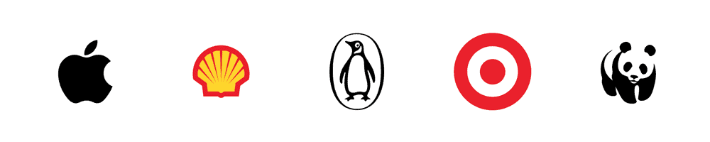 Designers will tell you that logomarks are more ‘abstract’ than their logotype brethren, as they are symbols and they don’t necessarily sit next to the brand name. Companies such as Apple have successfully used a logomark as their corporate symbol. The silver apple with the missing ‘bite’ has become inseparable with the brand over the years.