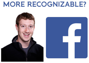
 However, there is an instant connection from everyone with an internet connection between their logos and their brands. Why? Because their logos are used in everything they do as a company.
Facebook is one of the most popular sites in the world, individuals see their logo multiple times a day when they update their status, upload pictures or share things they find interesting on other sites. The prominent Apple logo, on the other hand, is pasted across their product line (iPhone, iPod, iPad, etc.) and is present in all of their commercials and advertisements.
This isn’t Zuckerberg and Jobs being egomaniacs, its because their logos help build the brand of their business. People start to gain familiarity with a logo and the more people see a logo, the more they begin to trust a business.
But what makes the Facebook and Apple logos so great?
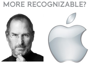
However, there is an instant connection from everyone with an internet connection between their logos and their brands. Why? Because their logos are used in everything they do as a company.
Facebook is one of the most popular sites in the world, individuals see their logo multiple times a day when they update their status, upload pictures or share things they find interesting on other sites. The prominent Apple logo, on the other hand, is pasted across their product line (iPhone, iPod, iPad, etc.) and is present in all of their commercials and advertisements.
This isn’t Zuckerberg and Jobs being egomaniacs, its because their logos help build the brand of their business. People start to gain familiarity with a logo and the more people see a logo, the more they begin to trust a business.
But what makes the Facebook and Apple logos so great?
EACH GREAT LOGO SHARE THE SAME CHARACTERISTICS.
They’re simple, appropriate, timeless, adaptable and unique. Some business owners fail to recognize that a strong logo helps consumers make decisions. A poor design can actually demean a company. Consumers don’t need to be graphic artists themselves to recognize clipart or a bad font choice. So don’t settle on a logo because you don’t think you have time, money or enough artistic ability to create a great logo, instead recognize the key qualities beforehand so you can make an educated decision.SIMPLE
 Simple logos are the best for so many different reasons. A logo with a simple design gets straight to the point and has no distractions. There is also no background noise or distractions and complement the other characteristics that make good logos great.
APPROPRIATE
 A logo should be appropriate to your brand and your consumers. The Apple logo for example hits the nail on the head when it comes to making it appropriate for both. Apple prides themselves on being on the cutting edge of technology. They don’t offer the cheapest products, but the best. Their products are slick and elegant and their logo encompasses all of those things. The design also appeals to their most passionate consumers, which are technology savvy adults, typically a little younger (16-35) and also have a passion for design.
TIMELESS
 The worst thing a company can do is continuously change their logo throughout their existence because, like we said before, people being to familiarize themselves with a logo and that’s what consumers start to trust and base their decisions upon.
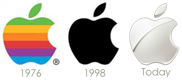
As you can see, since 1976, Apple has only changed their logo three times. However, the same basic concept as been around since the beginning. The company has only updated the color scheme based on where the brand has gone over time.
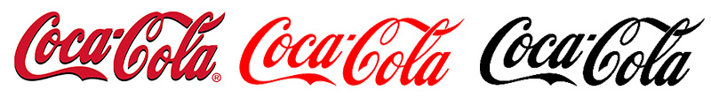
Pepsi on the other hand, has drastically changed their logo throughout the years and is one reason why people tend to believe that Coca Cola is a stronger brand.
The worst thing a company can do is continuously change their logo throughout their existence because, like we said before, people being to familiarize themselves with a logo and that’s what consumers start to trust and base their decisions upon.
As you can see, since 1976, Apple has only changed their logo three times. However, the same basic concept as been around since the beginning. The company has only updated the color scheme based on where the brand has gone over time.
Pepsi on the other hand, has drastically changed their logo throughout the years and is one reason why people tend to believe that Coca Cola is a stronger brand.
ADAPTABLE
 This is crucial when advertising. A logo shouldn’t lose its affect when being printed on different mediums. So Whether you plan on printing business cards, ordering promotional products, buying a newspaper ad or billboard, your logo should always have the same look and feel as the full color design.