Graphic Design for Print vs The Web: 15 Vital Differences You Need To Know About
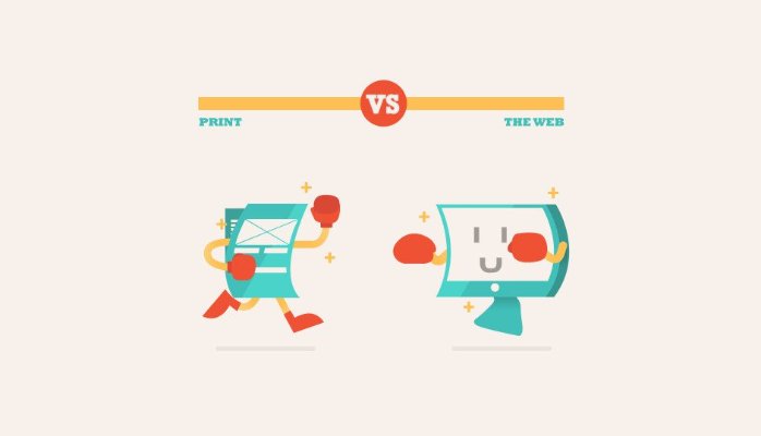
Print and web: two sides of the same design coin.
Though print and web designers have a lot in common, there are some important variations that people (both outside and inside the industry) often don’t understand — ranging from workflow and file formats to tools and terminology. While certainly not extensive, the following guide offers a brief overview of some of the biggest (and often, the most confusing) differences between the two disciplines.01. Viewing Method: How Users Approach Your Design
One of the biggest differences between print and web designs is how people view them. Holding something physical in your hand — a piece of paper, a folding brochure, a book — is a much different experience than viewing something on a screen. There is some crossover, such as digital magazines that are laid out in the exact same way as their printed counterparts, but generally, the physical versus digital experience is a pretty clear dividing line between print and web design. Where and how designs are viewed play a big role in the decisions designers make.02. Experience: How Your Design Engages Users’ Senses
Closely related to the physical or digital nature of a design is how users experience it. Both print and web design share a visual quality in common — the design needs to make a good impression no matter what the final product. To this visual component, print design adds a tactile experience that might include texture, shape, or printing effects like letterpress, embossing, or screenprinting. The web design experience adds the possibility of audio/video elements and other interactive options (more on that in under #3).03. Static vs. Interactive: The Design Lifecycle and How Users Connect with a Project
Once a design goes to the printer, it’s not going to change (barring a decision to re-design and re-print — which costs time and money; not ideal). Web design, however, can be tweaked, changed, or completely redesigned at any time. Many websites, especially those with frequently changing content — a news website, for example — will look different every day. Different pictures, different text; they’re created to change.04. Usability & Navigation: Making Your Designs User-Friendly
Since print design is contained to the physical size and shape of the surface or object, navigation is usually limited to flipping or unfolding a page. On the web, it’s not so straightforward. Users might encounter any number of different layouts and need an easy way to find the content they’re looking for. That’s where menus come in. They have become the hub of website navigation, and need to be in a location that’s easy for visitors to find.05. Compatibility: Testing Out Your Web Designs
For web designers, compatibility forms a major component of creating a great user experience. Any design for the web — including websites, emails, e-newsletters, and other formats — need to display and operate correctly in different web browsers and with different operating systems. This can get complicated, since these various platforms each have their own limitations. For instance, iOS, Apple’s mobile operating system, won’t render any Flash-based designs, and Internet Explorer (versions 8 or below) can’t display SVGs (scalable vector graphics). Web designers have to keep all these issues in mind and more to make their designs as user-friendly as possible for as many people as possible.06. Layout: How You Arrange Your Content
Both print and web design have many design elements in common: typography, images/graphics, shapes, lines, color, etc. So, many of the same best practices apply to each. Each approach also has its own unique layout requirements. For print, all information must be presented within the constraints of the printing surface, whereas for the web, designers have almost unlimited flexibility to organize, arrange, and filter information. Printed projects must meet certain standards using parameters such as margins and bleeds, while websites aim for a consistent experience between different viewing methods, such as web and mobile. Because various browsers may change a web designer’s original layout, achieving top functionality requires testing with different browsers and operating systems.07. Size: Making Good Use of Your Design Space
Size and layout go hand in hand. For print design, the size of the printing surface is one of the biggest determiners of how the designer will make use of that space — what design elements will be used, the amount and size of the text, etc. Though there are standard sizes for many projects (letters, business cards, posters, photos), possibilities are virtually unlimited, as paper and other printing surfaces can be cut to any size or shape. For web, “size” is more abstract. The sizes that designs are viewed at tend to be limited to a certain number of devices that are currently available — from computer monitors and laptops to tablets and smartphones, but that content should ideally scale to fit any device. That adaptability, known as responsive design, is becoming increasingly in demand as people’s web browsing habits shift in a more mobile direction.08. Resolution, Part 1: Overview & DPI (Making Sure Your Designs Look Their Best)
It’s important to understand the basics of resolution for both print and web, since resolution determines image quality — how good photos and graphics look in your final design. That being said, bear with me; we’re about to get a little technical here. You’ll often hear resolution referred to using two terms: DPI (dots per inch) or PPI (pixels per inch). Many people mistakenly use these interchangeably, but they’re really two different things (Even software developers that should know better — Adobe included — have labeled these incorrectly at times). DPI comes into play in the actual printing process — it’s the density of the dots of ink printed on an inch of printing surface.09. Resolution, Part 2: PPI (Making Sure Your Designs Look Their Best)
PPI involves the number of pixels (the square building blocks of a digital image) displayed in an inch of screen space.“The acceptable amount of PPI needed for a quality print is dependent on the size of the print. Larger prints are generally seen from farther away than small prints, so a lower number of PPI will generally look acceptable visually….Without magnification, the human eye can’t differentiate detail in a print greater than 300 PPI. Depending on the printer, the general standard today requires 300 PPI for a quality print.” You may often hear printmakers and even designers express the need for a file saved at 300 DPI. They really mean 300 PPI.
10. File Types: How to Choose the Right Format for Your Design
Designers have a multitude of file types to choose from. But which ones are right for which situations? Are some more suitable for web than for print, and vice-versa? Although all those acronyms can get confusing, it helps to understand that every file format falls into two basic categories: raster or vector. Raster images are composed of pixels — digital photos are a common example — and their quality varies depending on their resolution (which we just discussed above). Distortion can happen easily if a raster image is enlarged beyond what its resolution (measured in pixels per inch) allows for. Vector images, on the other hand, are not limited by pixels. Without getting too technical, vectors refer to graphics that are defined by mathematical equations, allowing them to be scaled to any size without loss of quality. Here’s a quick rundown of some common file types, their characteristics, and what types of projects you can use them for: Both Print & Web:- JPG (or JPEG): Most people will be familiar with this one, the default file format on many digital cameras. JPGs must be saved with an appropriate resolution and in the correct color space (CMYK for print and RGB for web; more on that in the next section).
- PDF: widely used; preserves the original content and appearance of a file regardless of where or how it is viewed
- EPS: most common for saving vector graphics to preserve their scalability; not always readable on PCs
- PNG: high image quality; supports transparency/opacity
- TIFF: high image quality and large file size (compressing image does not reduce quality, unlike with JPGs); compatible with both Macs and PCs; commonly used for final handover to a printer
- GIF: supports graphics featuring animation and/or transparency effects; color capabilities not as good as JPGs (256 colors or less, so not appropriate for photos); ideal for simple graphics on the web, since low file size doesn’t negatively impact page loading speeds
- SVG: vector format that can be scaled up or down to any size without loss of quality
- PSD: an editable (raster-based) file created in Photoshop
- AI: an editable (vector-based) file created in Adobe Illustrator