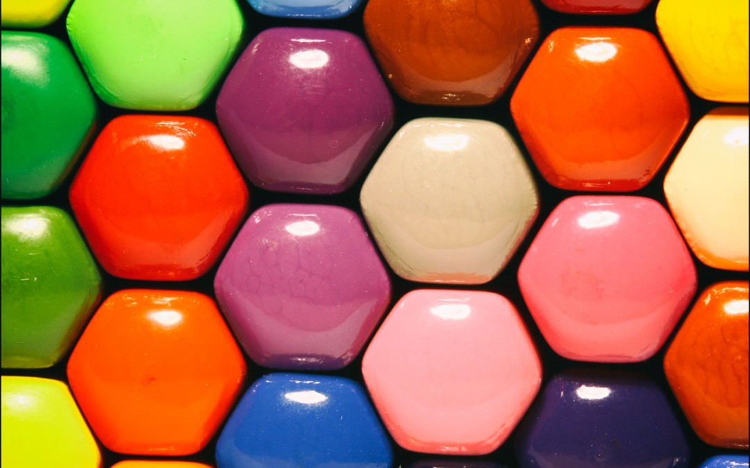
Picking a colour combination for a logo may not seem like the most difficult task in the world, but if you get it wrong, your logo design will suffer. Don’t let that put you off trying though; experimenting with colour combinations is one of the most enjoyable aspects of logo design. Below are some tips and tools to help you along the way.
Why Is Colour So Important?
A well-chosen colour scheme is the finishing touch to a logo design and can take it from being a good logo to being a great one. Your colour scheme is what makes you stand out, what makes you recognisable and what makes you you. If you get it right it can attract an audience and gain you a following. It will also make people remember you, which is one of the most important functions of a logo; without that there isn’t much point.The Effect Of Colours in Logo Design
Colours in logo design and branding can evoke powerful emotions, which drive an audience to invest in that brand. To give an example of just how powerful a colour can be, think about Cadburys chocolate. Their logo design and branding is based around that all too familiar shade of luxurious purple. Everyone knows that purple and instantly thinks of Cadbury when they see it – now that’s powerful. Cadbury chose this shade of purple very carefully; it represents power, richness, quality and imagination – everything you want in a chocolate bar. Cadbury has had so much success with this hue that they spent 5 years battling to trademark it, making other companies unable to use it. So, if you put plenty of thought into the meaning of the colours you use, you could really reap the benefits when you become a recognisable household name.How Many Colours Should You Use?
 If you look at most of the big brands in the market today, you will notice that they tend to incorporate just 2 or 3 colours in their logos, with the third tone usually being used as an accent shade. The other 2 usually act as the main ‘brand colours’.
When approaching your logo design it would be wise to avoid using more than 3 colours as a maximum. This is mainly because too many can confuse your logo design and cause no end of nightmares when it comes to printing. It can also look gaudy and messy, in the same way a poster design would if you used 4 different fonts. Keep it concise and simple for the most effective outcome.
How To Choose Your Colours
Here are some useful tools to help you experiment with and choose colours for your logo designs:Adobe Kuler
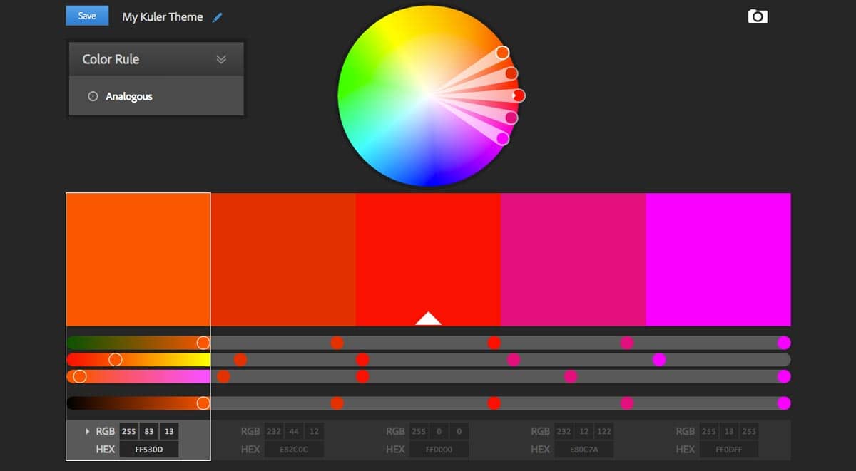
 This amazing free online tool is probably the best known and most popular. Integrated with the Adobe Suite, it’s perfect for playing around with any colour you could ever want in your logo. There are a lot of scheme creators out there that allow you to do different things, but Kuler combines them all into one tool.
The best thing to do, if you haven’t already, is to create an Adobe ID in the ‘My Themes’ tab. This way, you can create and save the themes you create, revisiting them if you want to. Kuler is great because it makes creating colour schemes incredibly easy and gives you lots of options. You can even upload images and create colour schemes from them. If you’re making a logo with a nature theme, for example, you could upload a photograph of a landscape and create multiple themes just from that.
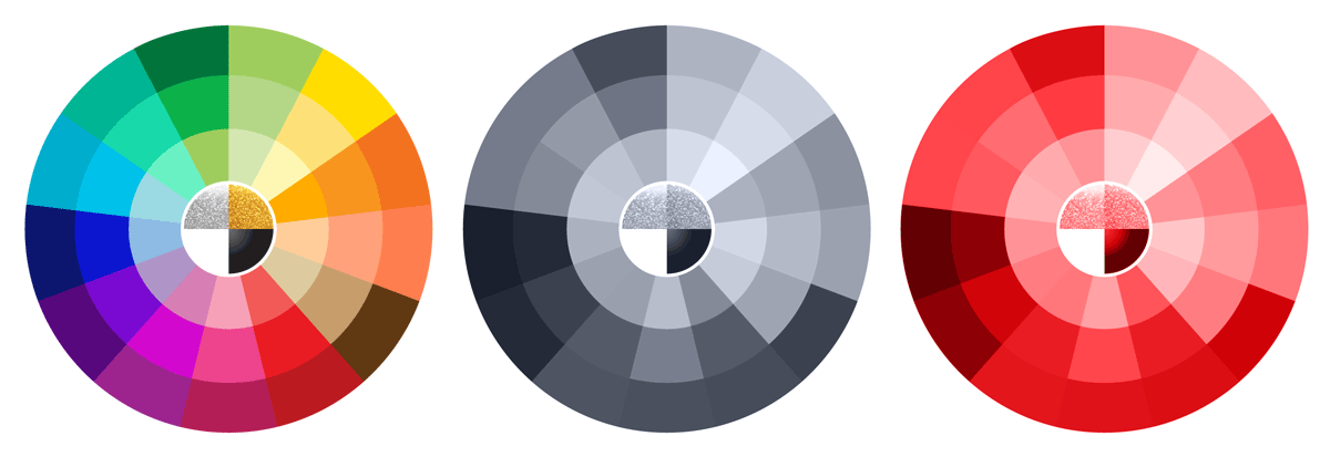
The Colour Wheel tool helps you choose themes by giving you various options, which you can choose from depending on what type of scheme you want your logo to feature. For example, you can create monochromatic, complimentary or analogous schemes. Or you can create a series of shades of the same colour. You can do all this within seconds, and what’s really great is that this tool can give you new inspiration as well as produce what you originally had in mind. To use colour schemes you have created and saved, all you have to do is click ‘download’ and save it to a location of your choice. If you have recent versions of the Adobe Creative Suite you can even access your themes within the programs; just look for Kuler in your ‘Windows’ menu.
Pantone
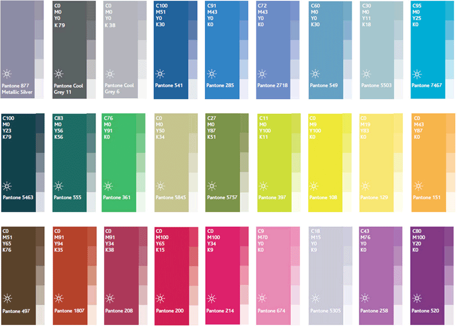
 If you are a professional designer working for a client, you may want use specific Pantone colours in your designs and projects. These colour guides can help you choose colour schemes for your design, making sure they will print out the way you want them to, avoiding issues with screen and printer calibration.
Flicking through the Pantone books is a nice, tactile way to gain inspiration and can provide a welcome break from the screen. You can browse palettes, put them next to one another and see what will work best when combined. Pantone also makes a point of telling you the meaning behind each hue. This can help you choose colour schemes that will tell the right story for your brand.
Once you have found the colour you like in the books you can then go back to the computer and find the exact variant in Illustrator and use them in your logo designs. They also correspond with the CMYK and RGB values for print and screen. This ensures you are using the best colour values for all display formats.]]>

