The psychology behind logo design allows your logo to truly connect with consumers by connecting with them emotionally and making them think twice.
HIDDEN [SUBLIMINAL] MESSAGING
Amateur designers have a hard time ‘thinking outside the box’. Their logo design must have something to do with ‘what the company does’ not necessarily ‘what the company believes in’. For instance, a plumbing company would have a plunger or a toilet in their logo somewhere. A travel agency, on the other hand, may need to see an airplane or beach. However, it doesn’t need to be that cut and dry. Some of the best logo designs have hidden messages within them that you may not notice after a quick glance. Their subtle use of negative space or hidden meanings are what sets them apart from the rest. Our infographic on subliminal design illustrates some of the best hidden messages in logos: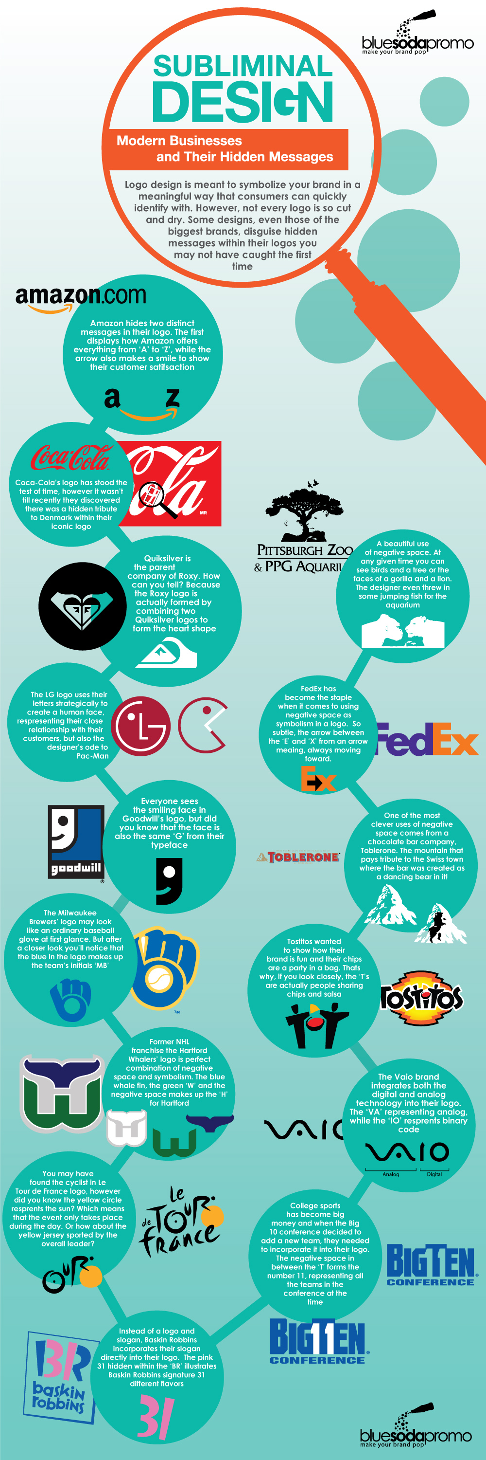
THE USE OF COLOR
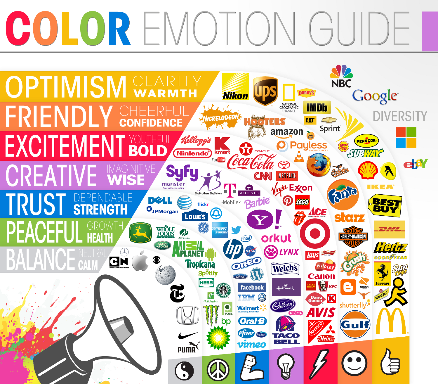
Our minds are conditioned to respond to color. We all know that red means stop and green means go. However, we also connect to color on an emotional level. So if you see red in a different context than a stop sign or street light you may think of love, passion, romance or danger. Green, on the other hand, may evoke the feeling of life, growth, nature or money.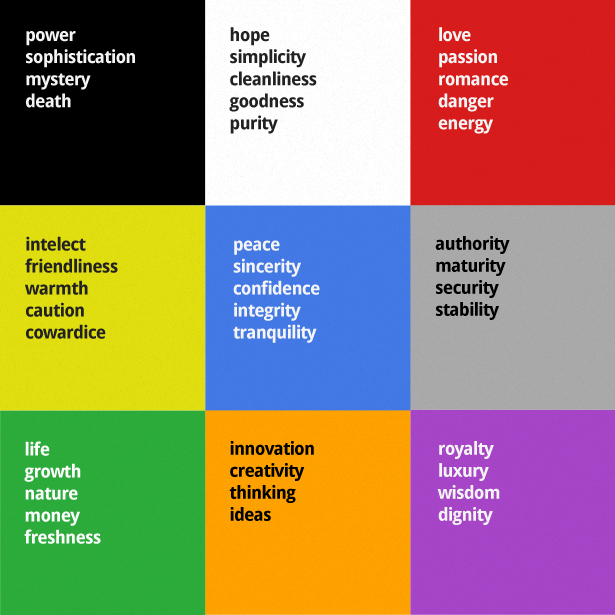 Source: Web Design Depot
And this emotional connection we have with color should also be evident in your logo design. What type of feeling do you want your brand to convey? Do you want to come off trustworthy or scream creativity? This decision on color comes back to what your company stands for and your brand standards. That’s why it’s important to have a business plan before you jump into something like a logo.
Source: Web Design Depot
And this emotional connection we have with color should also be evident in your logo design. What type of feeling do you want your brand to convey? Do you want to come off trustworthy or scream creativity? This decision on color comes back to what your company stands for and your brand standards. That’s why it’s important to have a business plan before you jump into something like a logo.
 Source: The Logo Company
The other approach companies take is trying to entice consumers with the use of color in their logo design. Restaurants, for example, tend to use the color red to simulate hunger: Pizza Hut, KFC, Popeyes, Wendy’s. While black and white in logo design can demonstrate elegance and sophistication: Chanel, Prada, Apple.
But remember, when it comes to design, the best logos are simple. It’s always best to stick with one color to deliver your message.
Source: The Logo Company
The other approach companies take is trying to entice consumers with the use of color in their logo design. Restaurants, for example, tend to use the color red to simulate hunger: Pizza Hut, KFC, Popeyes, Wendy’s. While black and white in logo design can demonstrate elegance and sophistication: Chanel, Prada, Apple.
But remember, when it comes to design, the best logos are simple. It’s always best to stick with one color to deliver your message.
SHAPES
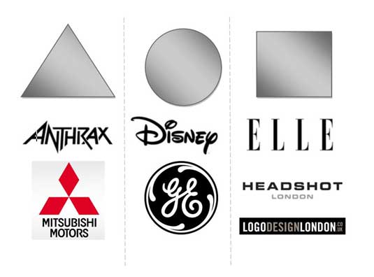
Like color, our minds interpret shapes differently as well. That’s why when designing a logo you need to be conscious of every line, curve or jagged edge.Did you know that a vertical line is typically associated with masculinity, strength and aggression where as horizontal lines communicate community and tranquility?Shapes, no matter how complex, are broken down and construed into their more basic form in our heads. Understanding the psychological effects of certain shapes will allow a designer to better tell the story of your brand.
- Circles – A round object can show a positive emotion and inner-connectivity. It reminds us of things like marriage, partnership and stability.
- Squares – The straight lines and sharp edges of a square object displays balance. It can also protray strong characteristics such as strength, professional and efficiency.
- Triangles – Triangles tend to give the feeling of power and are commonly associated with subjects like science, religion and law.
 Source: Creative Bloq
Knowing a company’s core values will give you a strong idea on what type of direction to take with the shape and design of logo. The more you understand a company the better product you can produce.
Source: Creative Bloq
Knowing a company’s core values will give you a strong idea on what type of direction to take with the shape and design of logo. The more you understand a company the better product you can produce.
TYPOGRAPHY
The typography you choose in your logo can tell a lot about your company. This will be the easiest thing for a customer to digest and each font type tells a slightly different story. Choosing the right font is critical in order to set the standard for your brand. A sans-serif font, like Helvetica for example, paints a much different feel for a company than a script font like Lobster. While I could go on about this, I think that Weemss has illustrated the point beautifully with their infographic: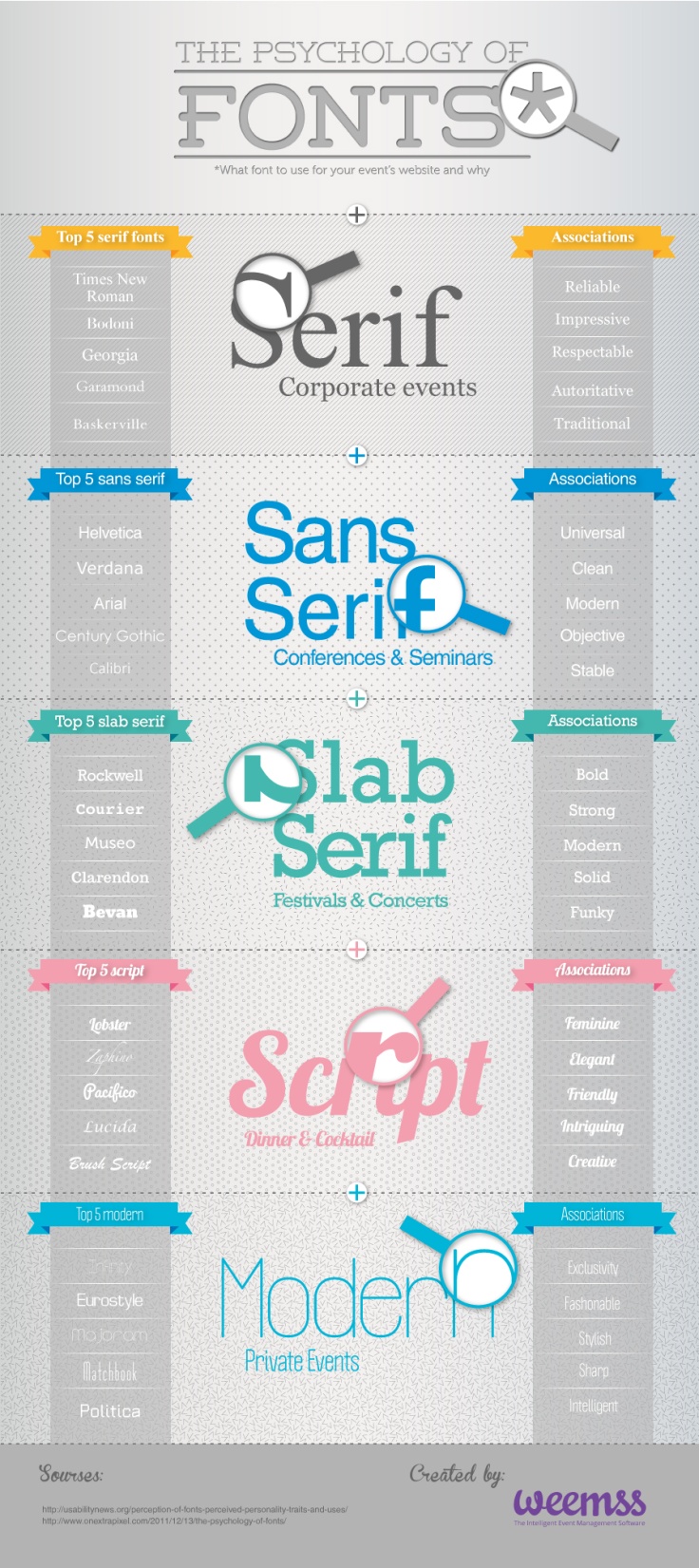 Source: Weemss