The solution, by reduction and simplification, is a process that’s been around for decades. It’s existed in all facets of design, from interior decorating to fashion, fine arts and photography – Minimalism. Minimalism is a way of thinking, a process, which strips the subject down to its bare bones. Removing all these superfluous elements leaves the ‘core’ essentials, free from distraction. It’s more than a trend or fashion, it’s is one of the most significant design movements of the 20th and early 21st century. As an admirer of minimalist design, with my own work usually accompanied to a soundtrack of minimal techno music, I thought it worthwhile to explore why “less is more”.
Why focus on minimalist design?
 In saying that minimalism isn’t a trend, it does seem to have regained a bit of popularity. You have to be careful in considering what is actually ‘minimal’ and what is simply a basic white space form.
Web design in particular has suffered some misconceptions, with ‘minimal’ themes soaring in popularity online. Having no content and limiting your colour palette to black and white, is not minimal design. There is a lot more to minimalism than black content and white space.
Minimalist design does have numerous advantages when creating a website. As I mentioned earlier, it can speed up the site’s loading times and improve front-end performance. Essentially, if you have fewer CSS rules, less JavaScript and codes to load, things can run more smoothly.
You may be surprised to hear that this can make things more difficult for the web designer since it requires more conceptual thought and effort. Minimalist web design done right is not easy by any means.
In saying that minimalism isn’t a trend, it does seem to have regained a bit of popularity. You have to be careful in considering what is actually ‘minimal’ and what is simply a basic white space form.
Web design in particular has suffered some misconceptions, with ‘minimal’ themes soaring in popularity online. Having no content and limiting your colour palette to black and white, is not minimal design. There is a lot more to minimalism than black content and white space.
Minimalist design does have numerous advantages when creating a website. As I mentioned earlier, it can speed up the site’s loading times and improve front-end performance. Essentially, if you have fewer CSS rules, less JavaScript and codes to load, things can run more smoothly.
You may be surprised to hear that this can make things more difficult for the web designer since it requires more conceptual thought and effort. Minimalist web design done right is not easy by any means.
Getting the ‘most’ out of minimalism in your design
You can’t just take a minimalist approach in a haphazard way, so here are a few of the best practices when considering it:- Use colour – don’t just go for black and white because of a self-imposed (and unnecessary) restriction. Use as much colour as the design requires – ‘too much’ colour could be used as a process of juxtaposition. You also shouldn’t focus on leaving white space for the sake of it, since ‘open’ space is more critical to communicate effectively.
- Think about the user – To paraphrase Steve Jobs, “design is how it works, not just what it looks and feels like”. When used correctly, minimalist techniques emphasize functionality and typography equally. Having a miniscule amount of information on a near empty page will just scare people away.
- Embrace clarity, not chaos – Don’t make the mistake of thinking a minimalist design adds mystery to your brand or website, you’ll just end up confusing people. If people want mystery, they’ll watch Sherlock; when they use a website, read a magazine or open an app, they want clarity, accessibility and intuitive functions.
Examples of Successful Minimalist Design
 Apple are an obvious example. They not only focus on a minimalist approach, it’s pretty much their business strategy. Just looking at their products, you’ll notice a similarity, cohesion in everything they produce.
iTunes ‘feels’ like Mavericks, Apple TV ‘feels’ like iOS. Even though the iPhone, MacBook and iMac are all radically different products, they are all unmistakably Apple, thanks to the shared material palette and detailing.
This minimalist design strategy is arguably one of the reasons Apple outshines it’s rivals. If you look to a Microsoft, Samsung or Dell product, you don’t see a relationship with other products in the companies range. With Apple, you are buying into a particular design language. When you move from one product to the next, you are already familiar with the new device and feel comfortable using it..
Apple are an obvious example. They not only focus on a minimalist approach, it’s pretty much their business strategy. Just looking at their products, you’ll notice a similarity, cohesion in everything they produce.
iTunes ‘feels’ like Mavericks, Apple TV ‘feels’ like iOS. Even though the iPhone, MacBook and iMac are all radically different products, they are all unmistakably Apple, thanks to the shared material palette and detailing.
This minimalist design strategy is arguably one of the reasons Apple outshines it’s rivals. If you look to a Microsoft, Samsung or Dell product, you don’t see a relationship with other products in the companies range. With Apple, you are buying into a particular design language. When you move from one product to the next, you are already familiar with the new device and feel comfortable using it..
Minimalism in a Nutshell
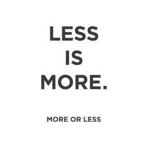
- Less is more: Only use the essential elements in a design where the final effect is greater than the sum of its parts. Get rid of any ‘clutter’ that isn’t critical to the function or content of your product.
- More or less: continue to reduce all non-essential fluff until you get to the stage where the design stops functioning. Find the limit but do not cross it to the point where it becomes ineffective.
- Space & Colour: Don’t be afraid to use colour, just be careful not to overdo it. Instead of filling white space, embrace it.
- Typography: always consider the fact that through minimal design, you are aiming to communicate effectively. Readability and legibility are therefore key when using typography in your designs.
- Grid alignments: especially with minimal web design, grids are a good way of aligning items so as to be pleasing to the eye as it flows through the content and white space.